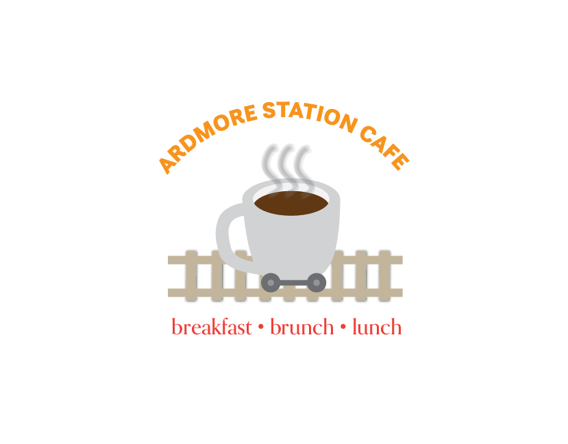
A logo concept for Ardmore Station Cafe built around a coffee cup on wheels, inspired by the diner’s location across from the Ardmore Train Station and its commuter-friendly grab-and-go appeal.

A broader view of the identity in use, showing how the branding extends across customer-facing materials and reinforces the café’s approachable, transit-inspired concept.
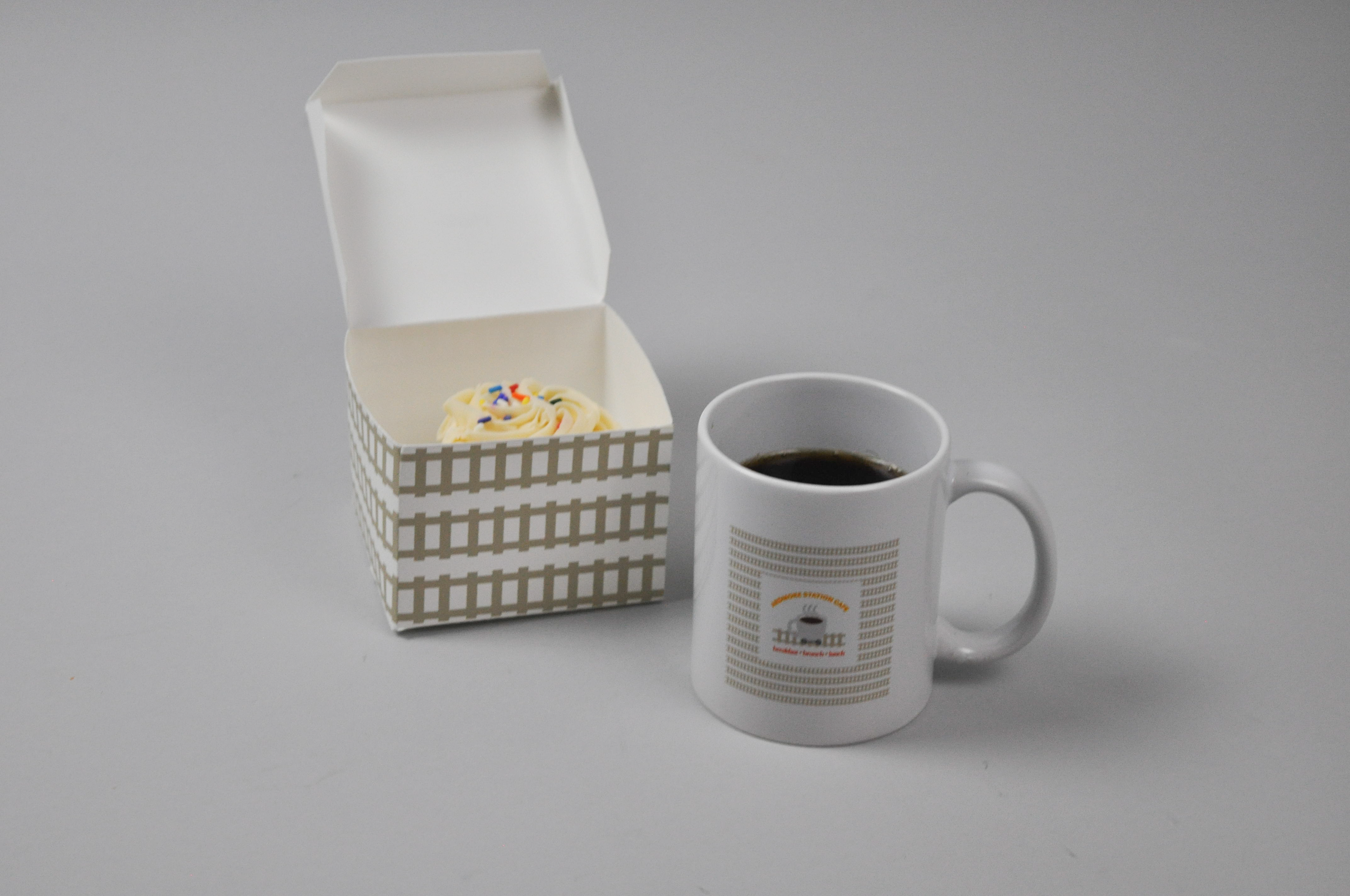
Branded packaging and drinkware created to carry the Ardmore Station Cafe identity into the customer experience through cohesive, everyday touchpoints.
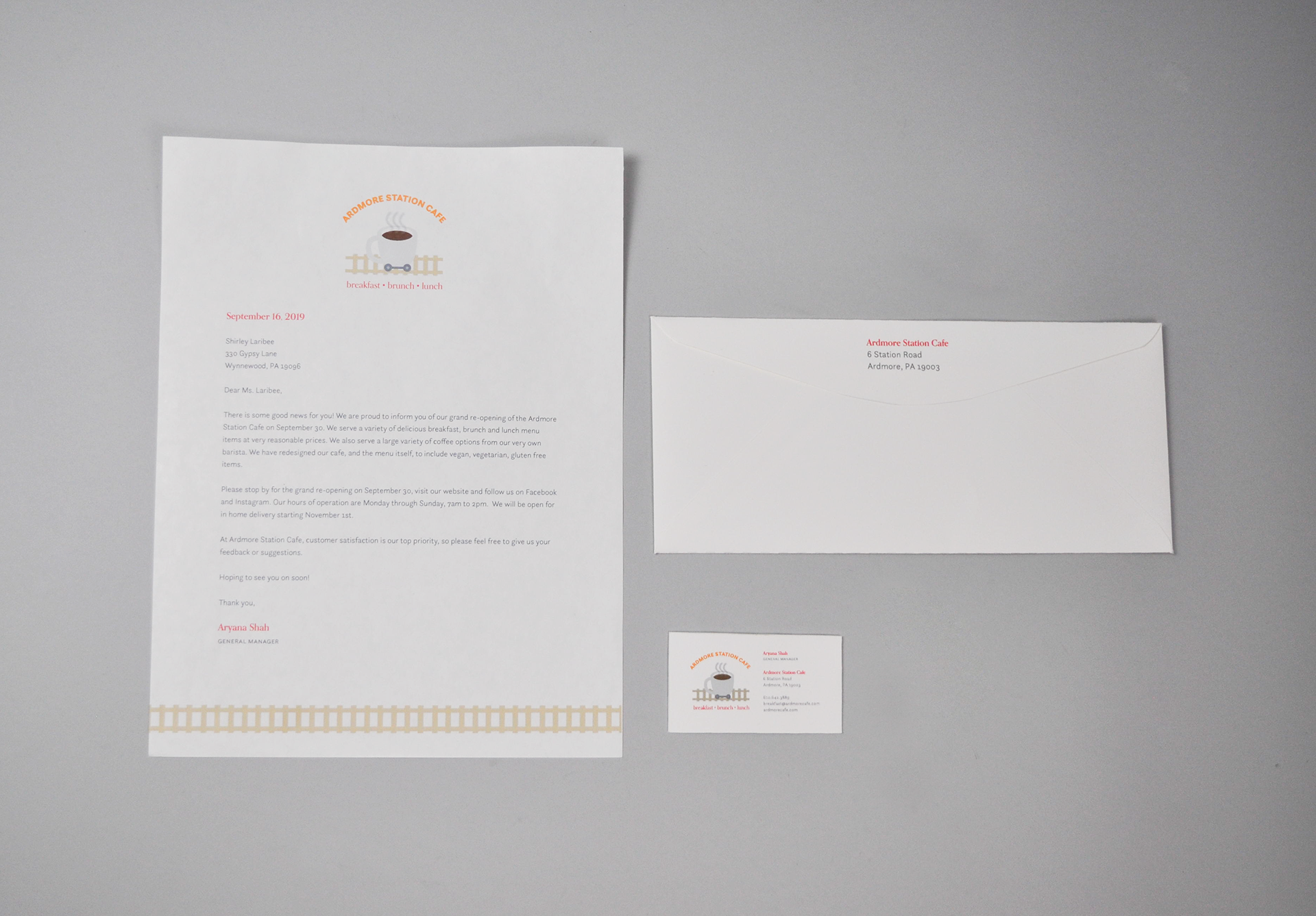
A set of professional print materials applying the brand across business collateral through consistent typography, layout, and visual presentation.
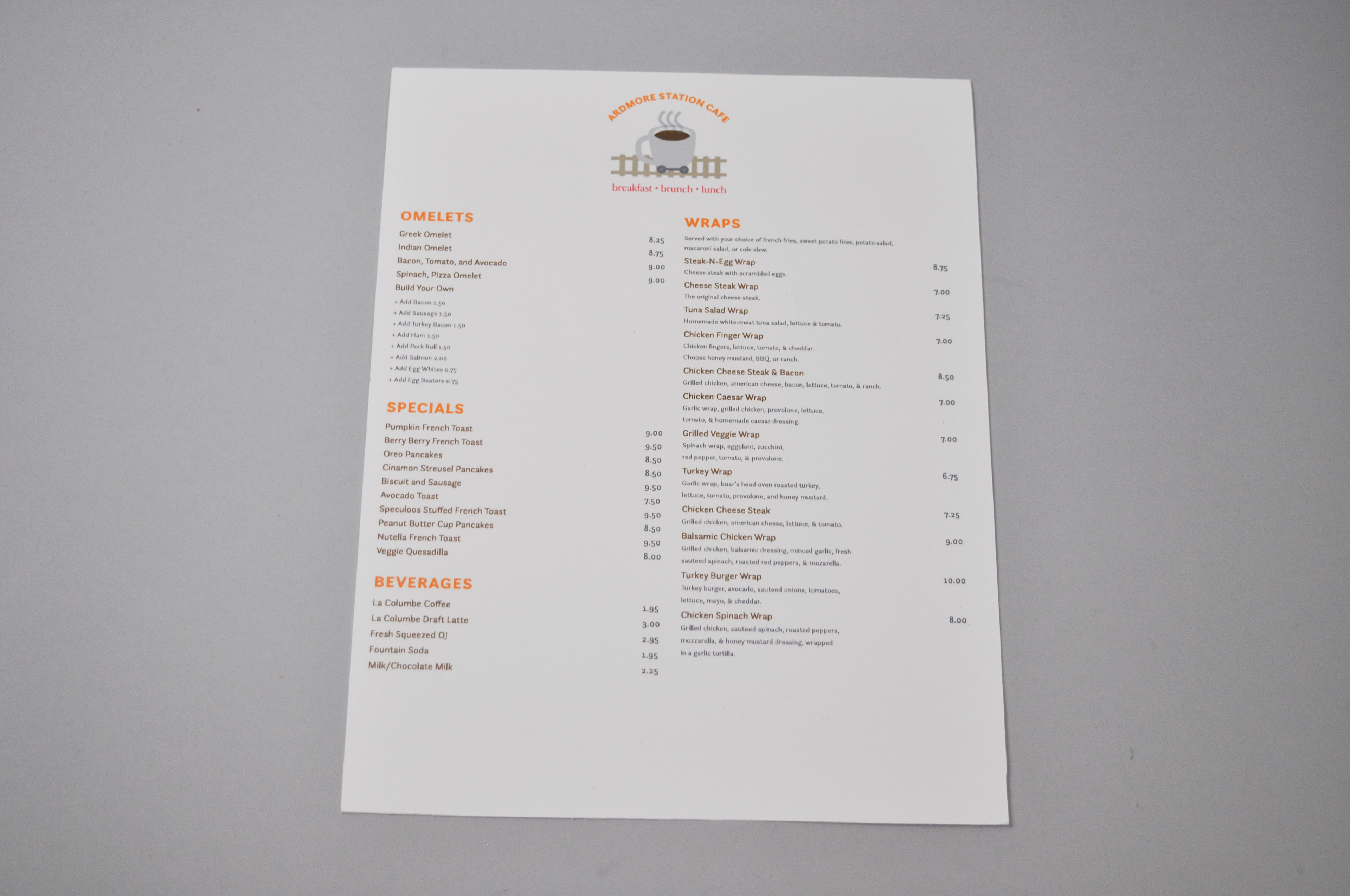
A menu layout designed to organize breakfast and lunch offerings through clear hierarchy, structured sections, and easy-to-scan restaurant typography.